
Today I learned a new technique to increase the usability of data visualisations without loosing information.
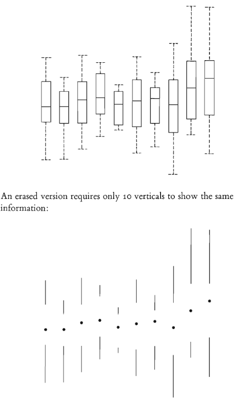
I’m very impressed by how powerful the removing of “ink” is, given the fact that when you visualize data you need ink. But it’s all about the data-ink ratio.
A very good example can be seen in the book “The Visual Display of Quantitative Information” by Edward Tufte on page 125.
Schreibe einen Kommentar
Du musst angemeldet sein, um einen Kommentar abzugeben.